Punk by Design
“Punk by Design” is a companion essay to the exhibition Pasted Youth: Analog Design of the Punk Movement, currently on view in the Thomas Gallery at John M. Olin Library through July 7, 2024.
Punk is not about the music, never was. There were the brand names (Sex Pistols, The Clash, Ramones, Buzzcocks, etc.), there were the isolated wonders (Snatch’s I.R.T. & Stanley, for instance), and there were personal passions (Johnny Moped, for me). That aside, much of punk was unlistenable. Maybe most of it. Not just the music that was meant to be unlistenable, either—Crass, for example—but also the stuff that actually intended to reach out to an audience. Has anyone played the Live At The Roxy album right through to the end since, well, 1978? Did anyone listen to Eater’s second single even at the time? And that’s just the stuff that was good enough to be recorded. Live shows could be—and generally were—even worse; far worse. (I write from the historical perspective of too many late nights at the Vortex on Wardour Street.)
That punk was a music movement was one of its great myths. The other big myth—about English punk, at least—is that it was a “working class” thing, a revolt of the excluded and impoverished, a 1970s uprising of the bondage-culottes. Punk—and punks—might, in Oscar Wilde’s words, have been in the gutter while looking at the stars, but that was mostly by choice. Nor, and this is the real point, were punks uneducated. True, there weren’t many PhDs around, but there were a lot of art school graduates—or at least dropouts. Band members: Sex Pistols’s Glen Matlock and three of The Clash, for example. Managers: Malcolm McLaren, most obviously. Above all, the designers who created the posters, fanzines, record sleeves, and flyers. These designers existed in a third space, a link between bands, fans, and record labels—whose art departments were far more supportive and (benignly) influential than bands and fans chose to believe.
Art and art schools played major roles in the 1960s and early 1970s pop: Keith Richards practicing guitar in his college toilet; Pete Townshend’s smashing guitar inspired by Auto-destructive Art, the 1959 manifesto of Ealing College of Art lecturer Gustav Metzger. The Beatles hired Peter Blake and Richard Hamilton to do album sleeves. The Rolling Stones used Andy Warhol and Robert Frank. Bryan Ferry named an album after a Marcel Duchamp piece.
Punk went further. It was, more than just about anything else, a testament to the post–WWII English art school tradition. Its ideas and fascinations were more those of modern art than popular entertainment. So it’s best to think of punk not as music but as an art movement.
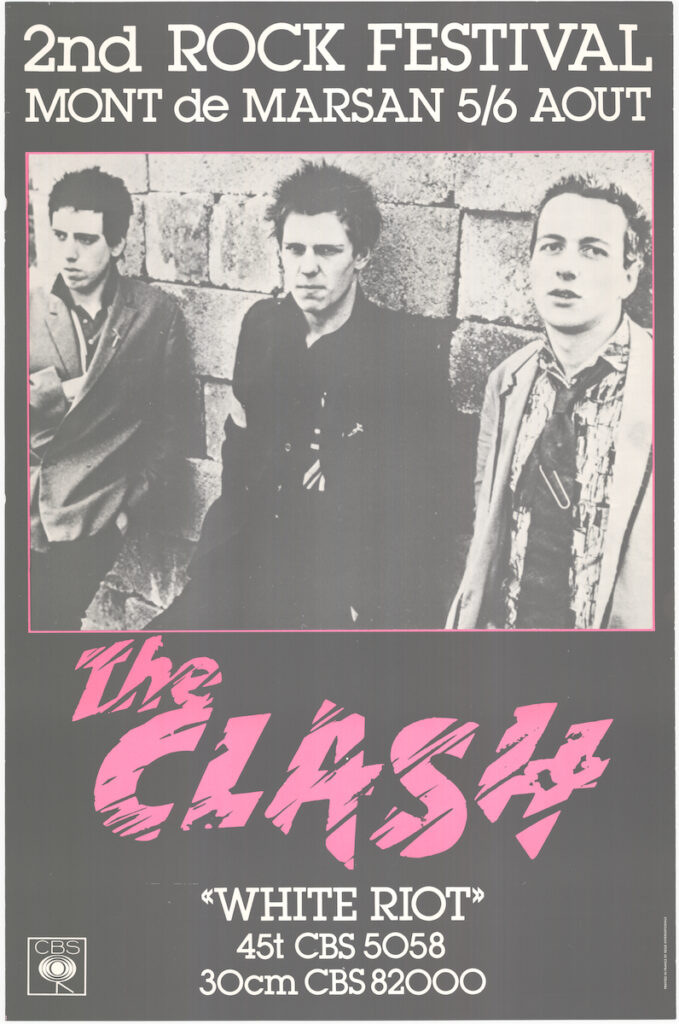
That was the case right from the start, maybe even earlier. Punk’s visual impact came before the records, almost before the live shows. It was making regular appearances in British national newspapers before the Pistols had played more than a gobbing of shows. In their earliest days, The Clash played both the RCA (Royal College of Art) and the ICA (Institute of Contemporary Art).
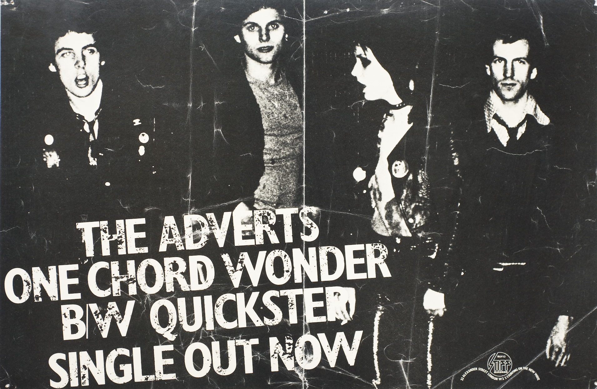
Punk swept a previous generation of artists, designers and art school graduates right along with it. Sex Pistols’ brand creator Jamie Reid (Croydon Art School) was its link back to the slogans and Situationist-isms of Paris, May 1968. Photographer Ray Stevenson, who created and self-published the Sex Pistols Scrapbook, was a previous associate of David Bowie. Ray’s brother Nils (Barnet Art School) was a King’s Road roué who became the Pistols’s road manager, and later took care of Siouxsie and the Banshees. Barney Bubbles (né Colin Fulcher, who studied art at Twickenham College of Technology), had created both the label for Strongbow cider and the pyramid sleeve for the triple album record of the first Glastonbury festival; then designed for Stiff Records—or more accurately, designed Stiff Records—and redesigned the New Musical Express (NME). The look and branding of Rock Against Racism and the Anti-Nazi League were the work of a small group of designers who were members of a Trotskyist grouplet, the Socialist Workers Party. One of them, Red Saunders, was by day a Sunday Times magazine photographer.
Photographers’ contributions are easily and often missed. Many designers and bands worked closely with particular photographers. Barney Bubbles collaborated with Brian Griffin (Manchester Polytechnic School of Photography)—whose main employer had been Management Today, a magazine owned by Conservative party star Michael (later Lord) Heseltine. Elvis Costello worked with Chris Gabrin (Bournemouth & Poole College of Art) and Chalkie Davies (British Airways aircraft maintenance, Heathrow)—who also had a close relationship with the Specials, photographing their debut album sleeve.
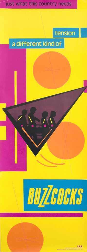
There was a whole new art school generation, too. The Sex Pistols’s first full show at Saint Martins School of Art was put on by Student Union representatives Sebastian Conran and Alex McDowell. A painting Alex made for his fine art course, Kop-Ra-Fill-Ya, showed a fellow student being fed through the bowels of a punk. His final show was consciously and deliberately shocking. The vice principal tore it down with his own hands. Sebastian is the son of Terence Conran, the designer, shopkeeper, and restaurateur, who was the single greatest influence on post–1960 British domestic taste and manners. (Barney Bubbles designed for Conran’s Habitat brand.) Nick Egan (Watford College of Art and Design, 1976) did covers for The Clash’s “Tommy Gun” and “(White Man) In Hammersmith Palais” singles. Neville Brody (London College of Printing, expelled, possibly in 1978) did a college concert poster for Pere Ubu. Peter Saville (Manchester Polytechnic, 1979) designed for Factory from the label’s first product: “FAC1,” a poster. Malcolm Garrett (Manchester Polytechnic, 1978) formed Assorted Images in 1977, and created the visual “face” of Buzzcocks—record sleeves, posters, and ads. Alex McDowell designed (and printed) some of the era’s most notable—and “shocking”— T-shirts, and coedited and designed the first punk issues of Terry Jones’ i-D magazine. Technological change also had a role in the emergence and elaboration of punk’s visual style: cheap(er) silkscreen printers; IBM golfball typewriters, which made small-run fanzine printing not just possible but cheap (free, if you hijacked the one you’d find, barely used, in a student union office); cheap(er) and more widely available Xerox machines—first black-and-white, then color. Xerox copies were used to make cutout “ransom note” lettering. This was done, according to Glen Matlock, because Xeroxing was far cheaper than buying another (expensive) sheet of Letraset when you ran out of the letters “a” and “e”, as you quickly did. Law and (lax) law enforcement played its part, too.
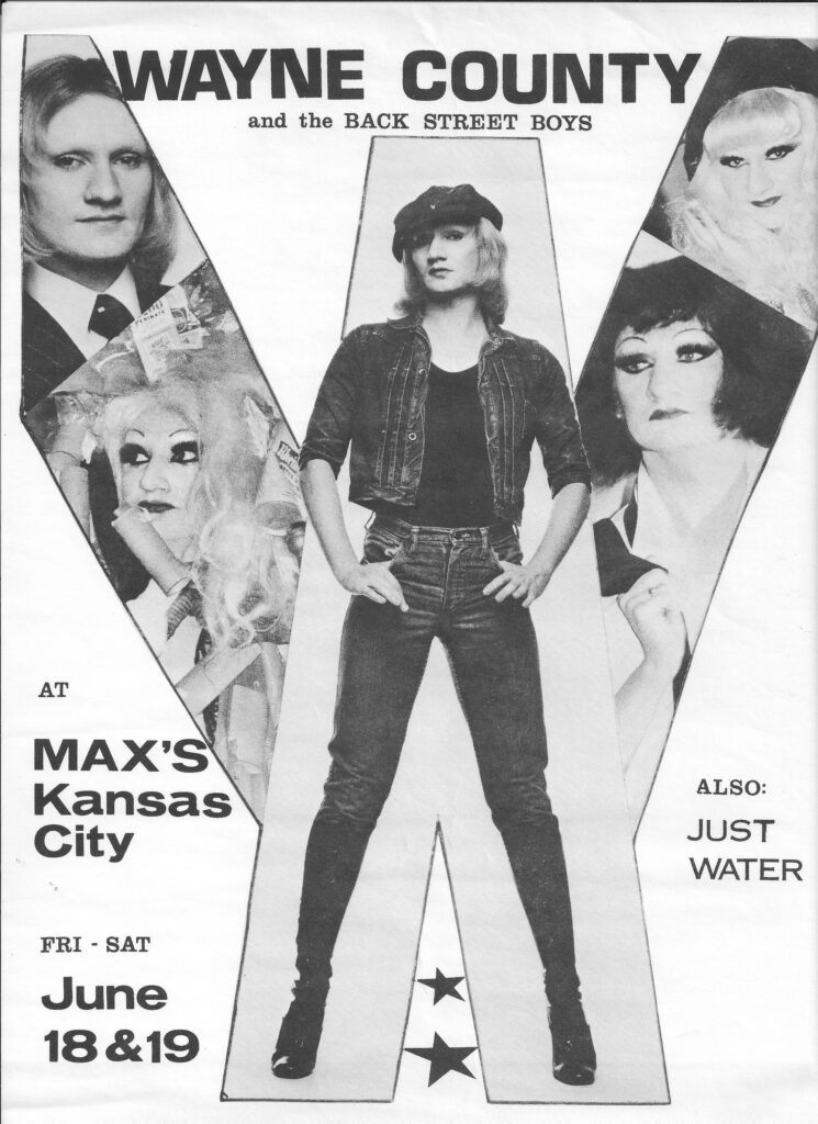
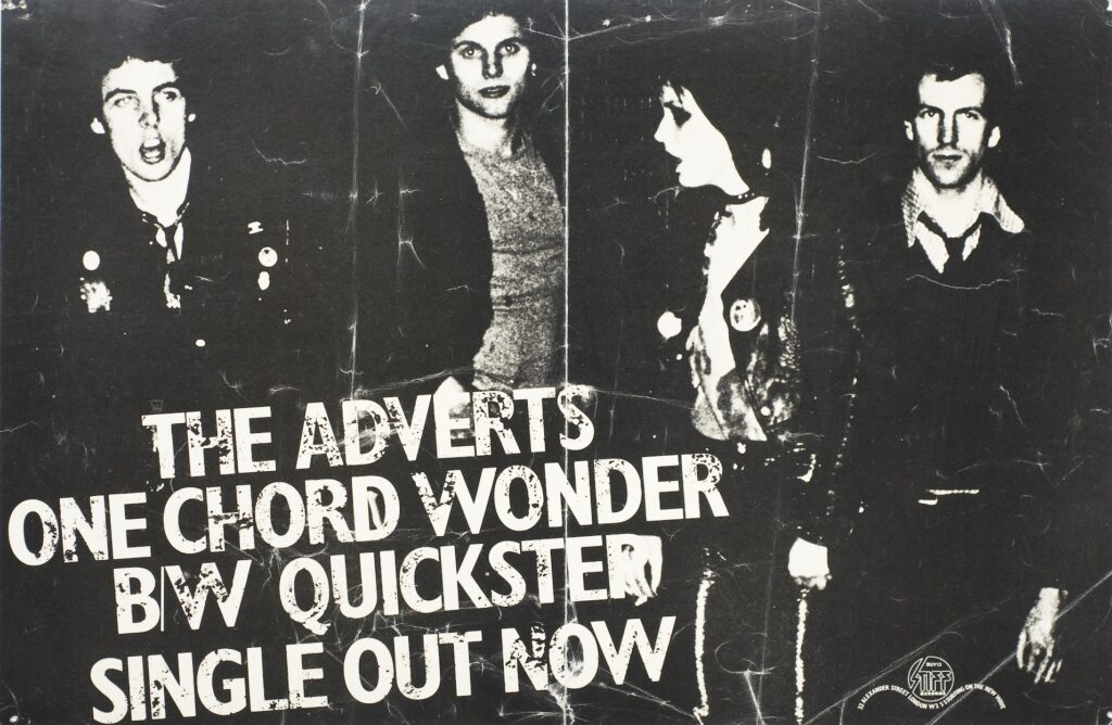
From Victorian times (at least) to the 1990s, urban British streets were papered with posters. It was illegal, but to stop it the authorities had to find and charge the printers—who, according to the law, were legally responsible. So the printers didn’t put their names on posters, and cities became punk’s open-air gallery. The distribution and placement system for these posters was itself a thing of wonder and semi-criminality. In London, it was run by a couple of chancers nicknamed Vic the Stick and Terry the Pill. Their vans cruised the city streets night by night, loaded with posters, brushes, and glue. They would, though, only ever put up a percentage of the posters you paid them for; the rest they would keep for themselves, boosting their income by selling them. It is possible, even likely, that a good number of the posters in this exhibition entered the marketplace via Vic and Terry.
Visually, punk reached out into the wider world quickly and easily. Its visual style became a cliché almost immediately: some pink, some black, some hand-drawn lettering. This rapid impact was a harbinger of its future, too. It’s a style that became—and remains—shorthand not only for the late 1970s / early 1980s but also for every kind of revolt, anger, blankness, challenge, left-fieldness, and overall discontent. There was a wider aftermath, too. Punk and its evolutions became major influences on the way the world looks now—as did the designers. Malcolm Garrett helped set the shape of the New Romantics and is now, among many other things, an ambassador for the Manchester School of Art and a Master of the Royal Designers for Industry. Peter Saville, via Joy Division sleeves and various design firms, including Pentagram, came to design the 2010 shirt for England’s football team. Nick Egan designed for Malcolm McLaren, worked with Vivienne Westwood and was one of the MTV video director generation. Sebastian Conran became head of product design at Mothercare in 1981. He has worked for John Lewis, run his own design company, and is on the UK Design Council. Alex McDowell formed Rocking Russian, a Soho-based design studio, creating record sleeves for The Clash, the Banshees, and Glen Matlock’s Rich Kids; then videos for the Cure, Iggy Pop, and many, many others. Later, he became a movie production designer, creating modern and future worlds for such films as Fight Club, Minority Report, and Watchmen. He is now a professor at the USC School of Cinematic Arts.
Neville Brody, whose first job was at Rocking Russian, went from magazines (the Face and Arena) to newspapers (The Times’ new typeface) to rebranding the BBC and becoming Head of Communication Art & Design at the Royal College of Art. Chalkie Davies moved to New York and became one of the world’s most significant still-life photographers, working with Nike, Gap, Donna Karan, and Apple, among others; it was his images that introduced iMacs to the world. Barney Bubbles designed for Ian Dury and Elvis Costello; then made videos for the Specials, Squeeze, and the Fun Boy Three. Not much music from the early days of Punk has stood the test of time, and frankly most of it was never intended to last longer than the explosive moment it was created in. But many of the designs that supported and surrounded the music have fared better, some have become timeless. Punk was the art school dance that did go on forever.
A prolific feature writer for Sounds in the ’70s and ’80s and later for MOJO, The Guardian et al., Peter Silverton was the author of books such as Essential Elvis, Filthy English, and (with Glen Matlock) I Was a Teenage Sex Pistol. He died, after a long illness, in May 2023.